Phoenix Pride
Style Guide
Support. Engage. Empower.
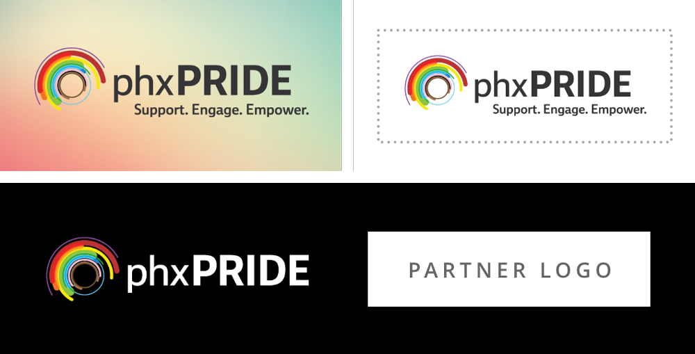
Our new logo reflects the work we do to Support, Engage and Empower the LGBTQ+ community, aligns with the spirit of our S.E.E. campaign with its lens shape and incorporates the colors representing a rainbow of diverse identities in the progressive flag.

Primary Logo

Secondary Logo

Proper Usage
- The logo should have adequate contrast against the background color, image or gradient.
- The minimum clear space around the logo should be equal to the height of the word “PRIDE”. Text, images, borders and other design elements should appear outside of this space.
- The logo may appear next to a partner logo. They should be equal in size, and have a space between logos that is equal to the width of “phx” in the logo.
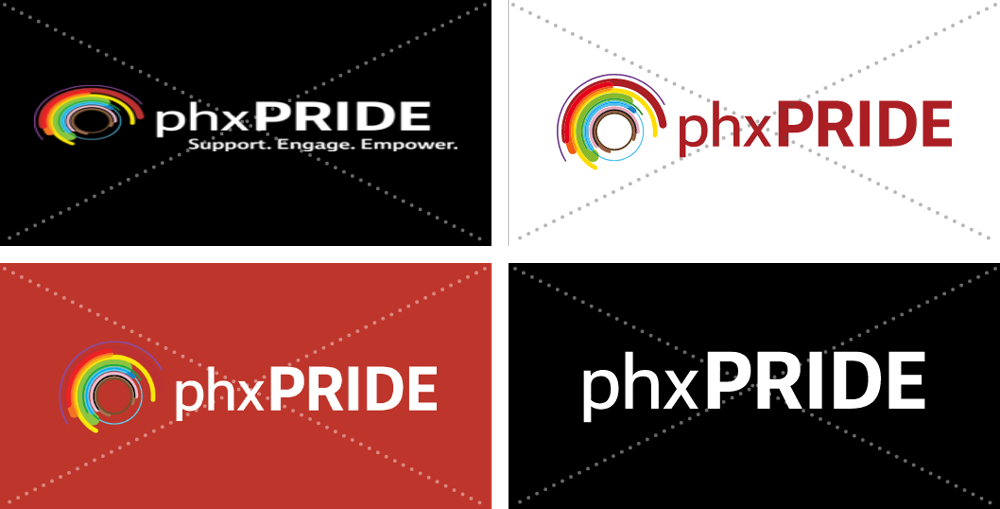
Improper Usage
- The logo should not be stretched, skewed or altered in any way.
- The logo colors and fonts should not be adjusted.
- The logo should not appear over a background where the logomark colors aren’t clearly visible.
- The logo should not appear without the logo mark.


Phoenix Pride Foundation is the voice of the LGBTQ+ community in the Phoenix area and the muscle for issues each of its members faces. Phoenix Pride Foundation aims to support, empower and engage the LGBTQ+ community, its allies and those in a position to create positive, lasting social change. Phoenix Pride’s photography should reflect this mission and include diverse ages, ethnicities, orientations and identities.


While bright and colorful photography and gradients are used most often to bring color into designs, Phoenix Pride’s brand colors may be used as accents in buttons, text callouts and callout backgrounds. The primary colors include brighter, warmer colors to help the accents stand out. Secondary colors include cooler colors.
Primary Colors

PhxPRIDE LIFE
HEX: #c72627
CMYK: 13 97 98 3
RGB: 199 38 39

PhxPRIDE HEALING
HEX: #f1672b
CMYK: 0 68 98 0
RGB: 241 103 43

PhxPRIDE SUN
HEX: #fcde34
CMYK: 4 4 99 0
RGB: 252 222 52
Secondary Colors

PhxPRIDE NATURE
HEX: #229346
CMYK: 83 12 100 1
RGB: 34 147 70

PhxPRIDE HARMONY
HEX: #0079c0
CMYK: 100 35 0 0
RGB: 0 121 192

PhxPRIDE SPIRIT
HEX: #7f4390
CMYK: 52 84 0 0
RGB: 127 67 144
Phoenix Pride’s primary tagline, “Support. Engage. Empower.” appears in the primary logo, but also may be used on its own. The secondary tagline “We S.E.E. you.” may be used in collateral that also contains “Support. Engage. Empower.” in the primary logo, the primary tagline, or in the copy so it’s clear what “S.E.E.” stands for.
Primary Tagline

Secondary Tagline


Photography, colors or gradients may be used as backgrounds. Logos, taglines, or copy overlaid on a background should have adequate contrast to be clearly legible. Since the logo mark colors will blend in to the background if brand colors are used, focus on darker tones when placing the logo on imagery and brand colors.

Phoenix Pride Mission
Phoenix Pride unites, educates, and engages people to support and empower the LGBTQ+ community and our allies.

